Saturday 26 February 2011

Developing packaging for quilt

Print on the label squares mimicking those on the quilt and infill them to suggest this behaviour to user.

Next step is to illustrate some example squares, scan them in, live trace them, then add them in place of the blue squares above to show how it works.

ASSESSMENT COMMENTS

- Type chosen too uniform - safe?
- Quilt packaging too muji - still doesn't suggest that the quilt can be personalised. Needs to be more enticing.
- Everything seems ready to sell - perhaps need to branch out more? Experiment? Don't necessarily need to keep to an implementable format?

Have been selected for the final team to work on a supplement for Nude Magazine's anniversary edition. woo

Sunday 20 February 2011

What if... solution

Photobucket

Digital clock that can be programmed to blur at certain times forcing the viewer to assume they are tired.


Packaging the patchwork quilt canvas

To be printed on clear adhesive film stuck on quilt to hold it together. A Structured Argument: Multiple iterations of a journey built along the same thread. Reflection on graphic design as a course and lifestyle and how we are judged within a strict marking structure.

Tuesday 15 February 2011

Misalignment

What if...? The Return

INITIAL WHAT IF QUESTION: What if a physical environment could manipulate emotive response of the brain causing a change in behaviour.

BROKEN DOWN: Emotive Environments

ORDER VS DISORDER

DISORDER AS OPPOSITE OF ORDER: Misalignment (OCD) - not at right angles, wonky, visual annoyance.


Canvas size: 485 mm x 365 mm

Title font: Futura

Body text font: Calibri

Body text: 8pt

Halftone images

Text to be very small, book text size so that the reader has to bring the piece close to themselves causing the halftone image to be unclear.


Selecting images

FRONT (Visible to reader)

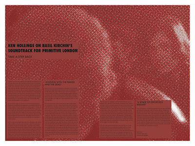
- Halftone image of snapshot in film where the background subject is looking directly at the viewer.

BACK (Visible to onlooker)

- Halftone image of snapshot in film of a sordid moment.

CONCEPT

- Halftone images only become clear when you take a step back from them, changing perspective. The text itself is prompting you to take a step back and re-observe the film via a different perspective - sound.

- Image visible to observer - sordid image exposed - to the onlooker the reader is partaking in a naughty activity - e.g. porn. Really the reader is absorbed in the concept of the film not its obviously scandalous facade.

Interim feedback

- Will need to work on how to make text readable (if laid over halftone image)

- Concept needs to be clarified


Wednesday 9 February 2011

Using colour filters to reveal and conceal

Will have to convert this image using colour half tone to gain an image that can be separated using colour filters. Blue to reveal on set of info (visual) and red for another.

Change in subject

Server at forefront - subject of image - only perceived in this snapshot - still in time - not the true case.

MOET Valentines Window - SOHO

Window display at The Vintage House, Old Compton Street, promoting the special edition Moet bottles for Valentines day which can be personalised with gold pen.


Experimenting with the unimportant

Observing the perceived unimportant and bringing it forward.


Tuesday 8 February 2011

Experiment 1 - Background activity


music - background


whats in the background


overpowering narration


subject - focus - CENSORED


appreciating a different dimension of the film